

The last phase in every drawing is detailing, no matter what drawing method I use. In today’s post, I’ll share the steps I took in detailing a horse portrait, using the portrait of Sego Lily Olena as the example.
NOTE: This process is essentially the same for all subjects.
Detailing a Horse Portrait
Detailing is where I get to add all those glorious details that bring a drawing to life. In a landscape, it often means adding touches of light glinting off leaves, grasses or other things.
With horse portraits, the detailing phase is similar, but is also often a bit more involved. Especially if the portrait includes a halter or other tack, or a background.
This portrait did include a fancy halter, but in this case, I spent more time working on the background than on the horse.
Here’s what I did.
The First Review
The first step in detailing is to take a short break from the drawing, then review it with fresh eyes. Most of the time, this means setting the drawing aside at the end of one week and looking at it again the following week. That’s what happened with this portrait.
Then I evaluate it on its own and side-by-side with the reference photo. What I’m looking for are areas that don’t look finished, or where I might need to add a few details.
Sometimes, there are no adjustments to make. When that happens, I sign the piece and move on to the next project. I suspected in advance that that would not be the case with this portrait, and I was right!
The Detailing Phase
Since I covered detailing the eye, ears, and muzzle in other posts, I’m going to focus on the portrait at large in this post.
Step 1
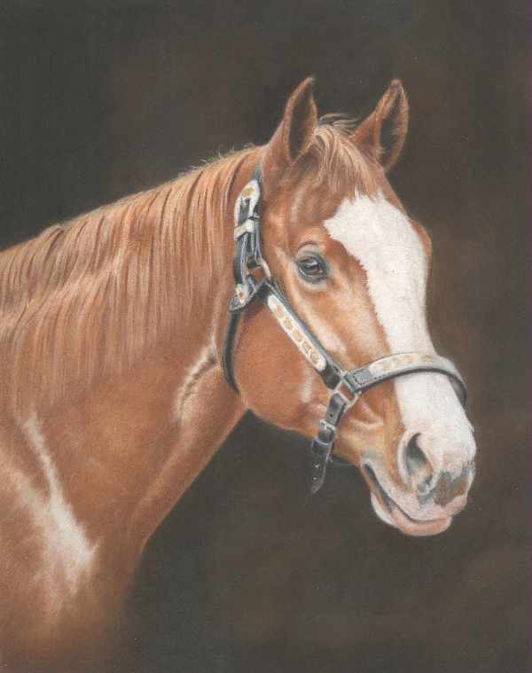
I used Prismacolor White, Cream, and French Grey 30% and 50% for the silver parts of the halter, and a mix of Cream and Jasmine for the yellow parts. I enlarged the reference photo to show just the area I was working on and worked my way down from the top.
But I was trying to add bright pinpoints of light, and the softer Prismacolor pencils didn’t make very much impact. There was just so many layers that I had to use medium-heavy or heavy pressure just to make a mark. So I did what I could with the silver, then moved on to the next area.
In the blaze, I used only White. I used short, directional strokes following the hair patterns in the lighter values. In the darker values, I scumbled White or used hatching strokes.
Then I decided to work on the background in an effort to smooth that out and hopefully “fix” a couple of blotchy spots. I used Black and Dark Brown for that. In some areas, I blended with a paper stump.
Step 2
I continued with the background, hatching and crosshatching Prismacolor Black over almost all of it.
In some places, I left patches of brown untouched. I layered only one or two layers in other areas, and added several layers (each applied in a different direction) over the remaining areas.
I kept the corners the darkest, but also tried to work darker values in around the horse.

Step 3
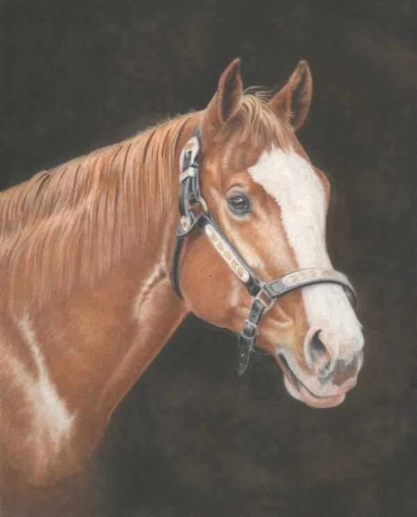
Next, I mixed Prismacolor Black and Dark Brown, alternating between the layers and mixing strokes as well as colors in the background. This time I didn’t dry blend. Instead, I relied on hatching and crosshatching to draw smooth color.
But I couldn’t smooth out the color enough to cover some of the odd tooth in the area around the shoulder. So when I finished adding color, I used a #5 round to blend with Gamsol.
I started with regular brush strokes, but the solvent seemed to lift color, so I used the brush, to push color down into the tooth of the paper.
I also added Black and Dark Brown to the shadows between some of the larger hair groups in the mane, especially up near the top, and darkened the inside of the ears, the inside of the nostril and the corner of the mouth with Black.
Step 4
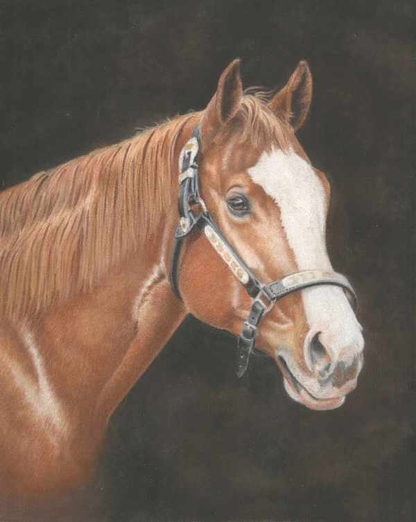
I started by smoothing out the edge between the solvent blended background and the horse in the lower left corner. For this, I layered Prismacolor Burnt Ochre and Sienna Brown over the area with medium-light to medium-heavy pressure and hatching and crosshatching strokes. I also mixed a little Dark Brown with those colors in the background.
Then I worked up into the shoulder with Burnt Ochre and Sienna Brown, and added Yellow Ochre and Jasmine into the edges of the highlight on the shoulder. Since I didn’t want that highlight leading my eye out of the portrait, I toned it down toward the edge with Burnt Ochre and some Yellow Ochre.
In addition to that, I worked on the mane with the same colors, but used longer, directional strokes to break up the hair groups and make the mane look more natural. I stroked in the direction of hair growth with Jasmine, Yellow Ochre, and Burnt Ochre.
Then I added coat colors up into the mane by stroking against the hair growth. That helped to make the ends of the mane look more natural.
Step 5
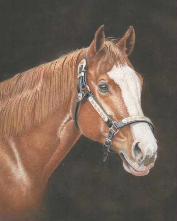
I continued working on the mane and neck with a mix of Prismacolor Pumpkin Orange, Sienna Brown, and Burnt Ochre as the main colors. I added Dark Brown in darker areas, mostly within the mane and in the shadow under the neck. In the lighter areas, I used Jasmine, Sand, and Yellow Ochre.
I tried adding White to the blaze and the highlights in the metal, but that didn’t work very well.
Step 6
I started out working on the blaze from the top to the muzzle. Caran d’Ache Luminance is the softest White I have, so I started with that. But it didn’t work, so I next tried Derwent Drawing Chinese White.
For both of these colors, I used short, directional strokes following the direction of hair growth. I used medium-heavy or heavy pressure. (You can read more about detailing the muzzle here.)
Next, I brightened up the brighter metal parts of the halter with Derwent Drawing Chinese White. Along with that, I darkened the shadows in the leather with Prismacolor Black.
The next area I worked on was the face around the blaze. I used a mix of Prismacolor Pumpkin Orange, Sienna Brown, Dark Brown, and Sand. Once again, I used short directional strokes, but I applied these colors with medium-light pressure or a little lighter.
I used the same colors on the forelock, and glazed Pumpkin Orange over the near ear and the parts of the face that were too dark or not orange enough.
At that point, I wasn’t sure what else to do with the drawing. I thought about signing it. Instead, I waited a day or two, then reviewed it again and found a few more things to do.

Step 7
I started by blending the mane with a narrow paper stump, stroking along the hair groups from top to bottom. That helped fill in the paper tooth quite a bit.
Layering Prismacolor Jasmine, Yellow Ochre, Sienna Brown, and Burnt Ochre over the blended area also helped.
I next tried the Derwent Blender in the mane, but didn’t care for the way that looked.
In the brightest highlights, I added touches of White.
I also dry blended the face with a paper stump, then added a little more color to that area.
I tried fine tuning the silver on the halter with Prismacolor Cool Grey 50%, but the details are so vague in the reference photo that I didn’t do spend much time on it.
The last thing I did was add a few eye lashes with Yellow Ochre and Sienna Brown.

The Final Review
After that, my instinct was that the drawing was finished, but I wasn’t sure enough to sign it. So I covered it and put it in another room for the weekend.
The next week, I took a final “big picture” look at it.
At that point, the portrait still seemed to need something. But I couldn’t decide what that “something” was. So rather than agonize over it for a prolonged period of time or run the risk of ruining it, I called it “done” and signed it.
The review and detailing phase took 299 minutes total. That’s 4 hours and 59 minutes spread over a number of days. From start to finish, this portrait took about 38.5 hours.
Detailing a Horse Portrait
As I mentioned above, detailing is different for every piece of art. Detailing a horse portrait also varies from one to the next.
But you now know the sorts of things I look for during the detailing phase.
This horse portrait is now finished, and so is this series.
I hope you’ve enjoyed these tutorials. All the previous links are below if you missed any of them or would like to read them again in sequence. You can also search for “Sego Lily”.
Posts in This Series
Sign up for Carrie’s free weekly newsletter and be among the first to know when she publishes new articles.


Beautiful horse portrait!
I wonder if using Polychromo pencils by Faber Castel to do the final details would’ve been faster.
They are a harder pencil and hold a sharp point so maybe it would be easier for detailing?
I’m pretty new to this medium so I’ve been mixing pencils willy-nilly without knowing any better and sometimes I’m shocked at the effect. Like beginners luck or happy accidents so…
Jeannie,
Thank you for your comment and your compliments on the portrait.
To answer your question, I have used Polychromos for detailing, but my general rule of thumb for Pastelmat is to use softer pencils over hard pencils. Looking back at it after a little time, though, I think you’re probably right. I could have sharpened the Polychromos to a finer point and they would have held the point longer.
Thank you again for your comment.