

This post is part of the ongoing series of posts involving the creation of a horse portrait on Clairefontaine Pastelmat. Today, I’m focusing on the horse’s halter, specifically drawing leather with colored pencils. I’ll also show you how I drew the “bling”.
I used a combination of Prismacolor Verithin, Faber-Castell Polychromos, and Prismacolor Premier pencils.
Drawing Leather with Colored Pencils
Step 1
This is the finished umber underdrawing. You can read a full account of this process here, so I won’t repeat a lot of detail.

In drawing the halter, I shaded only the leather parts with any detail. In the silver rings and buckles, I lightly shaded the shadows. You’ll notice that I didn’t do anything with the two pieces of “bling” on the cheek strap and noseband. The reason I did not do an underdrawing for those details is that I didn’t want the color toned down by earth tones.
For everything else on the halter, I was more careful to draw a nice range of values. I did not draw the darkest dark values, and left the paper color (white) to represent the lightest values.
I used Verithin Dark Brown for this step, kept my pencil as sharp as possible, and used light to medium-light pressure.
Step 2: Color Glazing, Round 1 with Verithin Pencils
In drawing the leather and bling, I did two rounds of color glazing, just as I did with the horse. The first round was with Verithin pencils. That worked for the horse because I had the right colors.
But since I didn’t have a Verithin Black for the halter, the first thing I did was make color samples on a small piece of Stonehenge.
The first sample was a mix of Dark Umber, Peacock Green and Terra Cotta. I alternated several layers of brown and green, then added Terra Cotta and alternated through the colors a few more times.
The second sample was Dark Brown and Indigo Blue.
The third sample was Dark Umber and Peacock Green.
The fourth sample was Dark Umber and Indigo Blue.

I made all of them pretty much the same way, alternating layers in an effort to get a color that was suitable. None of them really worked, but I decided the mix of Dark Umber and Indigo Blue provided the best base. That’s the fourth sample.
Step 3
Then I started working on the halter, piece by piece, with the reference photo enlarged to show just the area I was working on. Once again, I kept the pencils sharp, usually sharpening when I needed to draw details or clean edges. Pressure varied from light to medium, but I always used the lightest pressure possible.
Since there is a lot of variation in the values from one strap to the next, I used a mix of Warm Grey 20%, Dark Brown, and Indigo Blue, and varied the amount of each color depending on the amount of light illuminating each strap. For example, on the noseband, I used more gray and less brown and blue. I also started and ended with gray, sandwiching the darker colors in between. I finished with a layer of White to lighten parts of the strap.
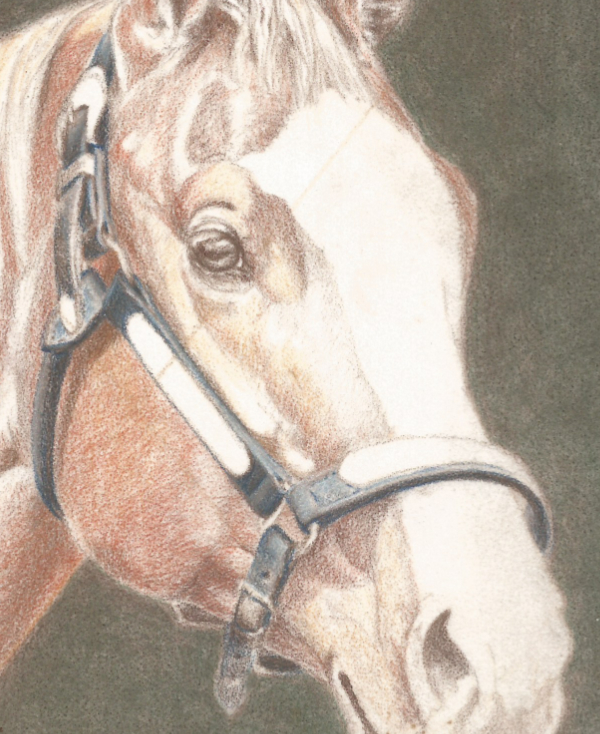
On the cheek strap, I used very little gray and more blue and brown, finishing with Indigo Blue to create a cooler dark value. I used more gray and very little brown on the top edge of that strap.
In the rounded strap that passes over and behind the cheek, I didn’t use any gray at all until I was nearly finished. I did most of this layering with Dark Umber and Indigo Blue. Then I added a little bit of gray along the back edge, where there’s a touch of reflected light.
Step 4
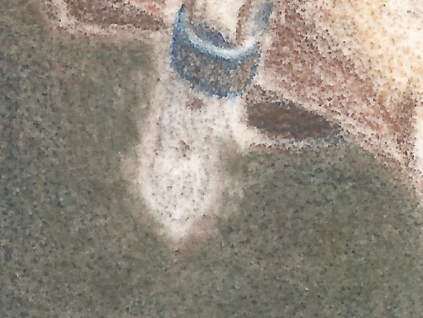
I didn’t finish all of the halter because I had some problems with the chin strap. Something about that strap just didn’t seem right, but I couldn’t tell exactly what.
So my next step was lifting as much color as possible, which I did with transparent tape. I laid the tape lightly on the drawing, then hatched and crosshatched on the tape with a slightly dull Verithin pencil. I used about medium pressure.
Not all the color could be lifted, but the change was significant.
Step 5
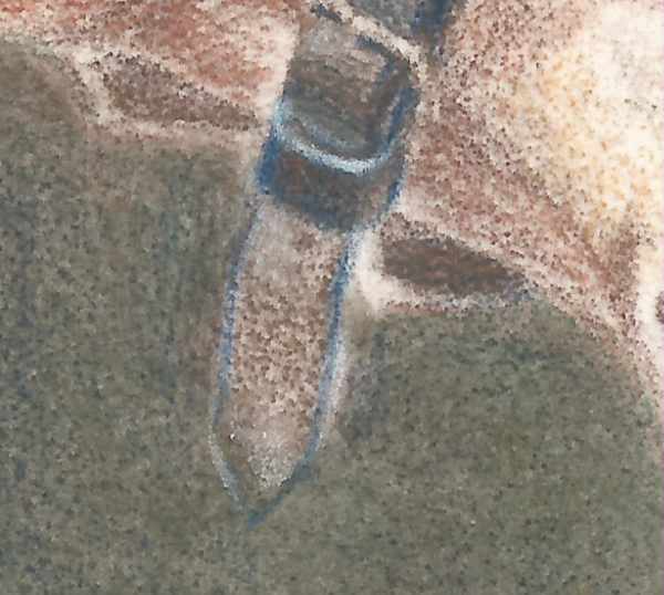
Then I used Verithin Indigo Blue applied with a sharp pencil and medium pressure to begin redrawing the piece of leather that circles the leather strap immediately below the buckle. I then glazed Indigo Blue over parts of that strap, followed by Verithin Dark Brown.
I also redrew and began shading the strap coming out through the buckle with Indigo Blue and Dark Brown. On the bottom curve of that, there’s a hint of reflected light. I drew that with Light Peach, then glazed Dark Brown over the edge of that to create a smooth transition.
Step 6
I continued working out the shape, colors, and values on the hanging strap with Indigo Blue and Dark Brown as the main colors, but using White and Light Peach for accents and reflected light as needed.
I also worked on the strap that goes under the head to the other side. There isn’t much to do with that, since it’s mostly in shadow, but I wanted to put a little more finish on it while I was working in the same area.
You may notice that I also worked on the background around the leather. I sometimes find it helpful to work from both sides of an edge. That’s also a good way to adjust shapes when necessary, but it works best on textured papers like Pastelmat.
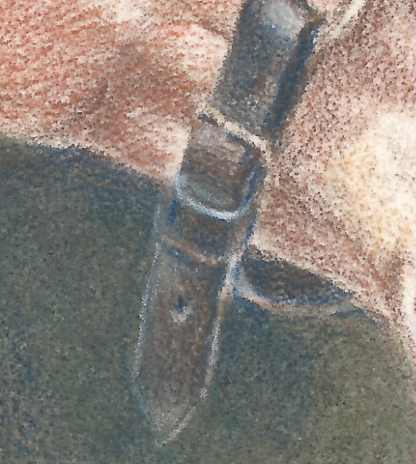
At that point, I decided I’d done everything I could do with Verithin pencils. This is the halter at the end of the first round of color glazing.

Next, Faber-Castell Polychromos.
Step 7 Color Glazing Round 2 with Faber-Castell Polychromos
I chose Polychromos because they’re softer than Verithin pencils, but still hard enough to hold a good point.
It’s easy to see which parts of the portrait I worked on first. I did a lot of work on the horse and with the background before touching the halter. I’m not sure why, but that is the way things worked out.

I started by darkening a few parts of the halter with Black, applied with medium pressure, beginning with the strap that goes over the neck behind the ears. As before, I worked my way from one strap to the next, finishing with the noseband. I used Black in the dark areas, and drew the lighter variations with mixes of Cold Grey V, Sky Blue, Ivory and White.
The order of color application and mix of colors was adjusted for each strap, so that they showed the amount of light each strap was getting. The colors were all the same for each strap, but the “recipe” was different. I used more dark colors in the darker areas and fewer in the lighter areas.
I was also very careful to fill in the tooth of the paper. A little bit of paper showing through on the horse is acceptable, but the halter needed to be as smooth as I could make it. Because of that, I kept my pencils sharper for this work.

However, I continued using the lightest pressure I could. It’s my practice to start with light pressure and increase it only as much as needed and only when it’s needed. If I could finish a piece using nothing but light pressure, I would!
Finishing this step completed drawing the leather. The final step for this phase was drawing the bling.
Step 8
I wasn’t sure how best to duplicate the look of the bling. It has a pattern of silver and gold, but the pattern is vague. I was able to find another photo showing a horse with a similar halter, but decided not to use it. The lighting wasn’t at all the same.
So I did the same thing with the bling that I did with the leather. I started with the simplest shape—the small ring at the top of the halter. The colors I used were White, Ivory, Warm Grey I, Brown Ochre, and, in the reflected light area on the noseband, Sky Blue. I also used Black for some edging on the halter.
Starting with a simple shape helped me get a feel for how the colors worked together. Seeing how well the ring turned out also gave me confidence for the other silver parts.
I can’t be specific in describing what I did because I was so focused on drawing that I forgot to journal the work! So I’m summarizing it as best I can.
I can say that I tried to avoid using White until the other values had been established. In addition, I also just roughed in the gold shapes on the metal with Brown Ochre, then applied Ivory over them to give them a more yellow appearance. I liked the way they looked in person, but didn’t care for it in the scan.
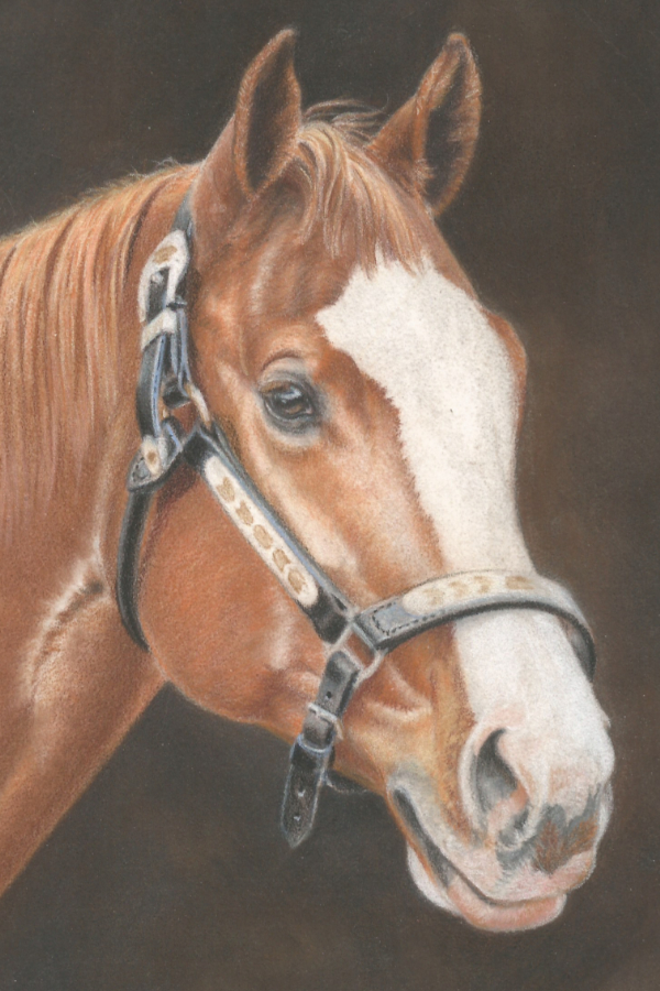
When I’d done as much as I could with Polychromos, the second color glaze was finished. Time for detailing with softer Prismacolor pencils.
Step 9: Detailing with Prismacolor and Derwent Drawing
I used Prismacolor White, Cream, and French Grey 30% and 50% for the silver parts, and a mix of Cream and Jasmine for the yellow parts. I enlarged the reference photo to show just the area I was working on and worked my way down from the top.
But that didn’t go as smoothly as I’d hoped.
The biggest problem was that the softer Prismacolor pencils didn’t make as much impact on all the previous layers as I’d hoped. I had to use medium-heavy or heavy pressure just to make a mark. For the time being, I had to be satisfied with doing what I could with Prismacolor pencils, then finding solutions for the remaining work.
I kept my pencils sharp, but that was more difficult to do because I had to use heavier pressure and the tips didn’t stand up to that very well. Consequently, I put my KUM two-hole wedge sharpener to work. It sometimes seemed like l sharpened after every two or three strokes!

Step 10
When I finished with the Prismacolor pencils, I brightened up the brighter metal parts of the halter with Derwent Drawing Chinese White. Derwent Drawing pencils are about the softest pencils I own, so it was easier to make marks with Chinese White.
But they’re also bigger in diameter, which made drawing small details difficult. I was quite happy with the bits of bright white I was able to add, though, and decided not to fuss too much over the intricate details. Had the portrait been larger (it’s 8×10 inches), then I could have done more.
To help emphasize the brightness and shine of the silver, I also darkened the shadows in the leather with Prismacolor Black.
I varied pressure depending on the area I was working on, but continued keeping my pencils sharp.

Step 11
When every other part of the portrait was finished, I used Cool Grey 50% to try to shape some of the shadows on the silver, but didn’t like the look of that at all, so didn’t do very much. In the end, I softened some of those shadows with a glaze of White and called it “finished”.

Drawing Leather with Colored Pencils
I can’t say for sure how long drawing the leather and bling took because I worked on it periodically throughout the drawing process.
I can tell you it seemed to take a long time! No matter what other part of the drawing I worked on or how well it turned out, I looked at that silver bling and cringed! It looked like the most difficult part of the process and it turned out to be that way.
I’m happy with the overall results. The halter looks like a halter, and that’s good. But I learned one thing: I need to practice drawing bling! A little practice drawing leather wouldn’t hurt, either, and I have some very nice photos of tack taken at an equine trade show years ago. Hmmmm!
In the next post in the series, I’ll get back to describing the overall process. There are only two phases left. The Polychromos color glaze on the horse and the detailing phase on the horse.
I hope you’ll join me for those.
Previous Posts in This Series
Drawing a Digital Grid on a Reference Photo
Drawing a Horse with an Umber Underdrawing
Drawing a Horse with Verithin Glazing
Want to read more posts like this? Sign up for Carrie’s free weekly newsletter and be among the first to know when she publishes new articles.


