

Drawing a Horse with Verithin Glazing is the fourth post in this tutorial series. In the previous posts, I showed you how to draw a digital grid on a reference photo and how to create the umber underdrawing. Links to all of the previous posts are at the end of this post.
Drawing a Horse with Verithin Glazing
The paper is Clairefontaine Pastelmat in White.
This is the finished umber underdrawing. As you may recall, I started out with Faber-Castell Polychromos pencils, but quickly switched to Prismacolor Verithin. You can read all about that here.

I took about a week off after finishing the underdrawing. Part of the reason for that was the number of other things (including Christmas) on my schedule at the end of the year.
The more important reason, however, was to make sure the umber underdrawing was complete to my satisfaction. I could continue making adjustments with earth tones after color glazing begins, but I wanted the underdrawing to be as complete as possible.
So a period of review was necessary. It’s always helpful to be able to look at a portrait with fresh eyes before moving to the next step.
Once I was convinced the umber underdrawing was complete, it was time to start with color glazes.
Step 1
I had already decided to do the first round of color glazes with Verithin pencils. Even though color selection is limited, I believed there were enough colors to do what I wanted to do.
Color glazing began with Verithin Pumpkin Orange. I chose Pumpkin Orange because the horse has a decidedly orange tinted chestnut coat. Terra Cotta was too red and the other browns were too dark and/or too blue.
I used light to medium-light pressure to apply the first glaze, starting with the middle value behind the uppermost halter buckle. From there, I worked down the neck to the throat and back to the shoulder. In each area, I worked around the highlights.
Then I shaded Pumpkin Orange over the lower shoulder and into the surrounding background, but not too much. Just enough to blend those two areas together softly.
I did not glaze Pumpkin Orange over all of the head because there are some quite dark areas around the halter and inside the ears. There are also some much lighter areas that aren’t highlights down the side of the face, and a very golden area around the muzzle. I worked around each of those areas with Pumpkin Orange.
Most of this layer was applied with hatching or scumbling strokes (mostly hatching). I did some crosshatching to create darker areas of Pumpkin Orange (see behind the ear).

Step 2
Next, I shaded Verithin Goldenrod into the highlights at the top of the neck, around the muzzle, and on the cheekbone. There is a lighter area above the eye where I also glazed with Goldenrod.
I also glazed Goldenrod into the more golden areas of the neck, cheek, and the area above the Pumpkin Orange between the cheek bone and eye.
I used light pressure and hatching strokes with all applications.
Finally, I stroked Goldenrod into the lighter portions of the mane with longer, directional strokes. I used light pressure here, too.

Step 3
The next step was adding color to the background. I started with one layer of Verithin Peacock Green applied over all of the background. Then I added extra layers in the corners.
After that, I added more layers of Peacock Green. I used hatching and crosshatching strokes, kept my pencil sharp, and used light or medium-light pressure for each layer.
I didn’t fret over getting an absolutely smooth layer of color. Letting some of the umber underdrawing show through created interest in the background. It also helped keep the spotlight on the horse.

Step 4
After finishing with Peacock Green, I layered Verithin Dark Brown over all the background with hatching and crosshatching strokes. I covered all of the background with at least one layer, but added more layers around the edges and in the corners. I kept my pencil as sharp as I could and used medium-light pressure for most of the work.
Even though these pencils layer very nicely, enough color was building up in the background to make adding more color difficult. I had been thinking of layering more Peacock Green over the Dark Brown, but instead, I blended with a paper stump. That produced a very nice “soft” look. There is still variation in color and value in the background, but it’s more subtle.

Step 5
Next, I worked on the horse again, and began with the cheek. I layered Verithin Pumpkin Orange over all of the cheek except the areas that are bluish from reflected light (toward the back edge) and the areas in shadow. I used medium-light pressure and directional strokes following the pattern of hair growth.
Then I layered Dark Brown over the shadow cast on the cheek beside the halter, and the form shadows along the bottom of the cheek and at the front, just behind the chin strap. Then I layered Pumpkin Orange over the cheek again, including over the shadows.
From there, I worked down the neck to the shoulder and up into the area behind the ears. There’s a warm, golden highlight along the top of the neck. I worked around that, too.
I used directional strokes on the neck down to the highlight on the shoulder. Below that highlight, where the shoulder fades into background, I scumbled Pumpkin Orange. Then I added Pumpkin Orange in the openings between hair groups in the mane.
There are only a couple of strong shadows on the upper part of the neck under the head. I shaded those with Dark Brown, then went over them again with Pumpkin Orange.
Finally for this step, I scumbled Pumpkin Orange on the backs and insides of both ears, and also glazed Pumpkin Orange on the parts of the face immediately above the halter.
Step 6
Next, I worked on the background again, but decided to use Indigo Blue.
I did one layer of hatching, then several layers of crosshatching. There is enough color on the paper to make adding more color increasingly difficult, so I increased the pressure to medium-light or medium. I also sharpened my pencil only as needed.
The result was significant and very pleasing. The background is becoming the kind of rich, dark value that I envision. That’s always fun!

Step 7
After that, I worked around the muzzle in general. In the gray patches in and around the nostril, I used Cool Grey 70% and Warm Grey 20% to block in the rough values. Inside the nostril, I then layered Indigo Blue and Dark Brown. I also layered White on the back edge of the nostril rim, where there is a faint highlight.
I used Light Peach in the pink parts of the muzzle.
Then I worked in the chestnut areas around the mouth and muzzle with Spanish Orange and Pumpkin Orange. Spanish Orange wasn’t really a good color choice, but it helped smooth out the color.
I also layered Dark Brown into some of the darker values in the chestnut, and added Indigo Blue in the darkest shadow along the lower jaw.

Step 8
I continued drawing the horse with Verithin glazing by working on the cheek. It’s a small area and relatively simple. I started with Verithin Pumpkin Orange, using directional strokes, a very sharp pencil, and medium-light pressure.
Then I layered Dark Brown into the shadow under the halter and the form shadows around the lower and front portion of the cheek. I put down a couple of solid layers of Dark Brown in the shadow cast by the halter. In the form shadows, I used more open strokes and added less color.
Then I added Terra Cotta into parts of the cheek. I worked around the highlight in the upper right area of the cheek to begin creating lighter values.
I also added Pumpkin Orange and Terra Cotta into the insides of the two halter rings.
Then I decided to try blending the cheek to smooth out the color.

Step 9
The dry blend worked so well that I blended the chestnut part of the area below the nose band, the middle and darker values in the face and in the neck.
It was easy to see that the more color I had on the paper, the better the blending results.
To finish this step, I mixed layers of Goldenrod and Pumpkin Orange in the mane, with Dark Brown in the shadows. I put Goldenrod in the lighter values and Pumpkin Orange in the middle values. I used long, directional strokes applied with light pressure for the mane.

Step 10
I’ve noticed with colored pencils that sometimes when I put a drawing away for the day, there seems to be more to do. Then when I look at the drawing the next day, it looks like everything is done.
That happened with this drawing between the previous step and this step. When I looked at the drawing before starting this step, I decided there really wasn’t much more I could do with the Verithin pencils. In fact, the only thing left to do was clean up the smudges.
So I used mounting putty to clean up the smudges on the blaze and around the margins of the portrait.
TIP: Verithin pencils leave a lot of pigment dust on Pastelmat. That’s because they’re so hard and dry. Don’t waste that dust! It’s what makes dry blending so effective.
But the dust is still fairly “free” even after blending, so use glassine or other paper to rest your hand on while you work. Had I done that earlier, I wouldn’t have had to clean up smudges!

Drawing a Horse with Verithin Glazing
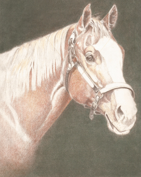
Drawing this horse with Verithin glazing took took 5-1/2 hours spread over four weeks. I didn’t work on it every day due to other obligations. There were also a few review days mixed in.
Overall, I’m very pleased with the way Verithin pencils work on Pastelmat. They’re a delight to use, even with such limited color selection. No, I wasn’t able to do as much detailing as I would have liked, but the ease of blending more than made up for it.
Would I recommend trying them on Pastelmat? Absolutely. If your drawing methods are anything like mine, you won’t be sorry.
NOTE: I did work on the halter in this round of color glazing, too, but I’m writing a separate post on that. You’ll read all about that in the next installment.
Previous Posts in This Series
Drawing a Digital Grid on a Reference Photo
Drawing a Horse with an Umber Underdrawing
Want to read more posts like this? Sign up for Carrie’s free weekly newsletter and be among the first to know when she publishes new articles.


I always love reading your articles and they certainly help me when coloring my stamped images for my greeting cards. Love your horse. When I was growing up always dreamed of having a horse. Thank you for all your tips and techniques. (And my cards thank you.)