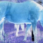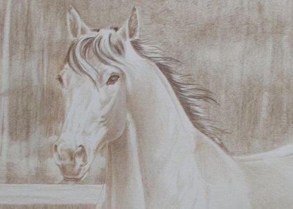
Today, I want to show you how I start an umber underdrawing. My demo piece is a landscape with a horse, but this process works with any subject and any type of drawing.
The Umber Underdrawing Process in General
For those who may not know, an umber underdrawing is the base layer. It’s done in earth tones, usually only with one or two colors. The underdrawing can be very detailed or it can include only enough details to establish the drawing.
The method comes from oil painting. A painting beings with an underpainting in browns, with enough detail so that color can be applied in thin glazes. The result is that the detailed underpainting shows through the color glazes, giving the finished painting a depth that’s difficult to achieve with other methods.
I used this method for many of my later oil paintings. I liked the results so much that when I switched from oils to colored pencils, I found ways to adapt the method to colored pencils.
How I Use Umber Underdrawings
Throughout this part of the drawing process, I use Prismacolor Light Umber. I almost always use this color because it’s a medium value color that is fairly neutral. It produces the darkest values necessary, but it’s also light enough to erase fairly well if I make a mistake.
If I’m starting with Faber-Castell Polychromos, the color I use most often is Raw Umber, but Bistre is also a good underdrawing color.
What you should look for is a brown that’s of medium-value. It should be dark enough to allow you to create very light passages as well as dark passages in your composition.
NOTE:
You won’t be getting the dark values as dark as you want them in the finished drawing. That will come as you layer colors.
The entire drawing should be built layer by layer to avoid getting too dark too quickly. The larger the drawing—this one is 16×20—the more time it takes. The more tempting it is to develop each area to completion before moving onto the next. For balanced values, it’s best to resist that temptation.
However, with a large work, it is easier to work in segments. I layered enough color in each area to establish the shapes before moving to the next area. In addition, I developed each area to the same degree before moving to the next step.
TIP:
I’m describing the process that works best for me most of the time. While I believe it will work for most artists, I also realize that we’re all different. Take what you can use of this process and adapt it to fit your needs and working style.
The First Umber Layer
Outlining the Major Shapes
After transferring the line drawing to Rising Stonehenge paper, I outlined the top rail of the fence. I added shading with horizontal strokes using very light pressure and a sharp pencil held in normal writing position. The strokes mimicked wood grain and didn’t cover all the area.
I started drawing the background trees with hatching, crosshatching, and other strokes to create a large area of light value. Once that was complete, I layered strokes to vary the values and duplicate the look of distant foliage.
Then I outlined some prominent trees and worked around those, as well as around the outside edges of the fence.

That corner became the benchmark for the rest of the drawing. I compared everything else to that area for type of stroke and value.
Shading within the Outlines
Then, I used loose, vertical strokes to shade the rest of the background trees. I applied most of the color with the side of the pencil to cover larger areas more quickly. Then I used the pencil point to do the detail work around the horse, the fence and in smaller areas.
I also outlined the ears, head, forelock, and mane as I worked the background. That helped me preserve those areas. It also began establishing the horse’s presence.
I also did a little shading in those areas, paying special attention to the horse’s eyes and one hoof. That was the fun part with which I rewarded myself toward the end of the drawing session.

The Second Umber Underdrawing Layer
Darkening Dark Values
After completing the first umber layer for the rest of the drawing, I added the second layer. Again, I used Light Umber, light pressure, and loose vertical strokes, but I worked over some of the areas I’d worked around last time and worked around some new areas to begin creating the sense of depth and of trees visible deeper within the background.
Here is a detail of the head and the area around it. Even though there are very few ‘lines’ drawn, the edges are beginning to take shape.

Notice also the vertical shapes in the background. I didn’t outline those, but worked around some of them in both layers and around some of them for one layer. Already, there’s a sense of depth in the background.
Adjusting Edges
I wanted soft edges where necessary, so that meant proceeding carefully and thoughtfully as I continued building values in the background.
Some areas needed to be “lined” in. The mane and forelock, for example. In those areas, I outlined each detail area, then filled it in with equal value. Even when I outlined first, the goal was to create edges without lines.

Darkening Values Again
I continued darkening the background behind the horse and fence. I carefully outlined each area, then filled in the outlines.
For everything else, I applied color in long, broad strokes with medium to light pressure. I didn’t want even color layers, but I wanted to darken it more quickly.
Next, I layered vertical strokes over all of the background, working around tree trunks and other background features. Then I applied looser, more random horizontal strokes to fill the space a little more. When I finished, the area was about as dark as I want to go without working up some of the other areas, too.
The last thing I did for this step was lay a t-square along the bottom of the drawing and use it as a bumper against which to define the bottom edge using Light Umber and very loose vertical strokes to apply the first color in that area.
I also worked on the tail a little bit and on the second hoof, but mostly to bring those two areas out of the background.
Finally, I worked on the foliage and grass, still using Light Umber. But now I focused more on smoothing the color and shaping the values.

Correcting an Error in Values
Later I noticed that the left and right sides of the background were not the same value (a common error in working a large piece in short work sessions.) At first, I added color in horizontal strokes in an effort to even up the two sides.
That didn’t work, so I tried lifting color with the click eraser. That didn’t work, so I got out mounting putty and dabbled around with that. That lifted color very well if I kept it carefully kneaded. I was able to lift some of the heavy darks just above the top rail in the background on the right and I liked that so well that I repeated the process on the left.
NOTE:
The ease of correcting mistakes, even big mistakes, is another advantage of starting with an umber underdrawing. Imagine trying to correct problems like this if the drawing was in full color!

The Finished Umber Underdrawing
After working out the landscape portion of the drawing, I went through the same process with the horse. This part of the underdrawing was more complex because shapes and values had to be more accurate.
But because I’d already worked on the values of the background, I knew how dark to make the horse.

Starting with an Umber Underdrawing
Umber underdrawings are a great way to figure out values and shapes without worrying about color decisions.
As I’ve shown you, this method also provides an excellent opportunity to identify and correct errors while they’re still relatively easy to correct.
But it isn’t the only way to start a drawing. For a brief explanation of other ways I’ve started drawings, read Comparing Colored Pencil Drawing Methods.