

Today I’d like to show you how to draw a cat ACEO.
What’s an ACEO?
Another name for ACEO is art trading card. The only requirement for an ACEO/art trading card is size. They must be 2-1/2 inches by 3-1/2 inches in size for drawings and paintings. Vertical or horizontal format, any subject, any medium, any style, any support. Everything goes as long as the artwork is 2-1/2 inches by 3-1/2 inches.
How to Draw a Cat ACEO
Today’s subject is Bing, one of the Kitten Posse from 2018. He’s now seven years old, but the reference photo I chose shows him as a young adult in August 2019.
Here’s the reference photo. It’s been cropped to the same proportions as an ACEO.

I created the line drawing directly from the photo and on clear Mylar film. Then I sized the line drawing to the appropriate size and printed it directly on a sheet of Beinfang Bristol Vellum.
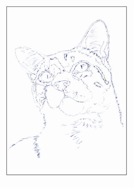
I also printed a border around the artwork so I’d know where to trim it when the time came. To be honest, however, I was thinking about framing it when it was finished and needed margins around the art. It was also easier to draw with some extra paper to hold or fasten on a clip board.
You’re welcome to print the reference photo and line drawing if you want to follow along.
You can also download the reference photo here and the line drawing here. The line drawing is larger than an ACEO so you can do this portrait larger if you wish.
Now let me show you how to draw a cat!
Step 1
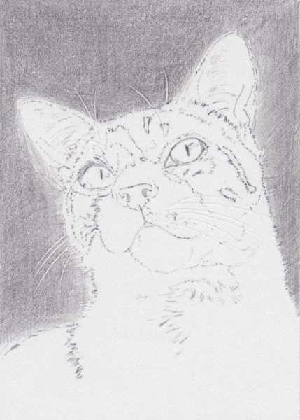
My goal was to do the background and to make it either Black or a mix of Black and Dark Green, since Bing was outside when I took the picture.
But before I started adding color, I used an impressing tool to mark the whiskers around the nose and above the eyes. I also impressed marks along the edges of the shadows in the chest and where white hair overlaps dark hair. You can clearly see the whiskers. The chest marks aren’t quite so clear.
The first color I used was Faber-Castell Polychromos Black. I picked that up without thinking much about it. I should have switched to Prismacolor after the first stroke. Instead, I did two or three layers of hatching and crosshatching strokes over all of the background, using both the tip and side of the pencil. I used light pressure because there’s so little tooth on this paper.
I also outlined the eyes and shaded the pupils.
Step 2
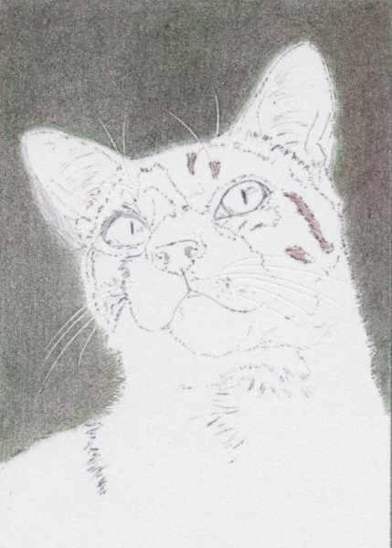
I switched to Prismacolor for the next layer and chose Dark Green, which I applied with hatching and crosshatching strokes and light pressure. I don’t know if it’s the layer of Polychromos underneath or the paper, but it already felt like the tooth was getting full. It also seemed like I needed a little more pressure to make an impact, but I tried to continue with light pressure.
Next I tried dry blending with a paper stump just to see if it would work. It did smooth the color a little, but it isn’t nearly as effective as using a paper stump on Pastelmat.
Then I added several layers of Dark Brown to the background. Although I resisted the urge to use heavy pressure so early in the process, that’s what I think it will take to get a dark background.
It was a lot more difficult to get smooth color, too, even with crosshatching, so I did three or four layers in some areas, just to smooth out the color.
Step 3
I began work on the cat by shading French Grey 10% over the left side of the chest and neck, which are in shadow. I started there because I wanted to impress more lines along the edge between the white hair on the chest and the dark hair on the back, but I didn’t want those impressed lines to be white.
But after I started that, I realized that I needed to impress lines on the edge between the lighted part of the chest and neck and the shadowed part. Those lines needed to be white, so I stopped shading and impressed lines along that edge.
Then I layered French Grey 10% over all of the left side of the chest and up to the edge of the chin and cheek.
There are some subtle value shifts in this shadow, so I used French Grey 20% to add those. For both greys, I used light pressure and directional strokes applied in the direction of hair growth. I tried to keep my pencils sharp, but did let them get a little dull more than once.
When I shaded around the chin, I impressed lines around the edge of the chin, too.
Next, I layered French Grey 70% over the back using light pressure and directional strokes with a sharp pencil.
There is a visible stripe, so I used Dark Brown to sketch that in, then layered Black over that.
I then stroked in a bit of Yellow Ochre along the left side of the stripe, where there is a bit of warmth. That was too yellow, but it at least marks out that area.
Then I stroked Black over the rest of the back using directional strokes and light pressure with a sharp pencil.

Step 4
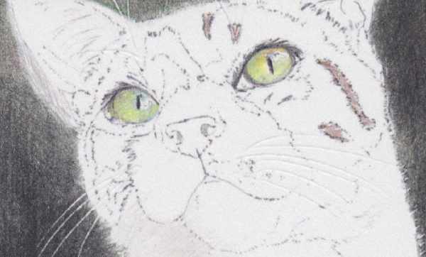
Adding color to the eyes began with a base layer of Yellow Chartreuse. I used a very sharp pencil and started with scumbling strokes, then switched to back-and-forth strokes radiating out from the pupil. I worked around the highlights in both eyes.
Next, I added Yellow Ochre on the top of each eyeball, then Dark Brown around the edges and in the shadow areas of each eyeball.
That worked pretty well, but Bing’s eyes are more of a gray green so I used Jade Green applied in a couple of layers with back-and-forth strokes radiating outward from the pupil.
Then I outlined both eyes and shaded the shadows around them with Black. I also darkened the pupils.
Step 5
In this step, I worked all over the ACEO, starting and finishing by adding Black to the background. The first thing I did was finish the Black layer with hatching and crosshatching and some scumbling. To finish for the day, I touched up the area around the back by stippling Black.
In between, I worked on the chest with French Grey 20% and French Grey 30%, darkening and shaping shadows between the tufts of hair. Some of them are pretty subtle, so I continued using light pressure and directional strokes and keeping my pencils sharp.
I also layered French Grey 20% and 30% over the shadowed side of the face where it’s white. I scumbled color onto the left side of the muzzle, and didn’t do anything with the right side. There’s also a darker shadow alongside the left eye, so I layered French Grey 30% there, too.
In the dark parts of the face, I used Bronze and Artichoke: Bronze on the right side (which is slightly lighter) and Artichoke on the left side. I used short, directional strokes in both areas, and followed the direction of hair growth as much as possible.
Then I shaded Light Peach into the nose and lip areas using scumbling strokes in the nose and directional strokes on the lip.
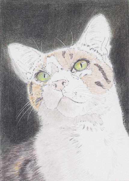
Step 6
I layered Warm Grey 20% in the lighter parts of the gray hair on Bing’s face, Warm Grey 50% over the middle values, and Warm Grey 70% over the darker areas. I used light pressure, directional strokes, and sharp pencils for all three colors, overlapping the colors to create smooth transitions.
In addition, I scumbled Warm Grey 20% over some areas in the face to soften the strokes.
Then I darkened around the right eye and in the darker areas with Black. I used directional strokes and light pressure with a sharp pencil.
In the white areas, I scumbled Warm Grey 20% to blend the previous layers of gray. This color darkened some of the shadows slightly and helped hide some of the line drawing.
Finally, I blended with Warm Grey 20% on the darker areas in the back to soften the strokes. The blending layer also pushed that area a little more into the background.
Along the top of the head, I stroked Black from the background into the edge of the head to create a more natural edge.
Then I worked on the background, mixing Indigo Blue and Black and a combination of strokes for smooth color. The two colors in combination helped make the background darker.
Then I used Cool Grey 70% to darken the shadows in all of the white hair. I used light pressure throughout and directional strokes to mimic the look of the hair.
Next, I applied Cool Grey 70% to the eyes to create shadows and subdued color in them. I used it most in the left eye, which is almost entirely in shadow.

Step 7
I glazed Carmine Red over the nose and inside the ears using a combination of scumbling and hatching strokes applied with light pressure. In all three areas, I worked around the lighter shapes.
I also scumbled Carmine Red into the lip and chin area.
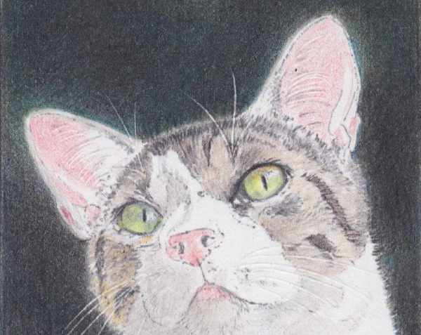
Step 8
I worked over the white hair with Cold Grey 20%, Cold Grey 50%, Warm Grey 20% and White. I used light to medium-light pressure and directional strokes to develop the shadows. After applying grays, I tried to add lighter highlights with White, but that didn’t work.
Then I used French Grey 70% to work over the dark areas on the head and inside the ears. In the shadows in the ears, I used scumbling strokes with light pressure. In the hair, I used directional strokes with light pressure.

Step 9
I started with a blending layer of French Grey 20%, using light to medium-light pressure with a reasonably sharp pencil over all of the cat except the eyes.
Then I went over the darker areas in the white hair with French Grey 30%. In the darkest areas, I used French Grey 50%. I used a mix of scumbling strokes and directional strokes with both colors.
In the gray parts of the face, I layered Black over the stripes and French Grey 50% or 70% in some of the darker middle values.
In the right ear, which is catching a little more light, I alternated layers of Carmine Red and French Grey 20% applied with light pressure and mostly scumbling strokes. I used some directional strokes to smooth the color.
In the left ear, I used Carmine Red and French Grey 30% applied with the same type of strokes.
Then I added the slightly darker accents with French Grey 50%.
I darkened the edges of the eyes with Black, and then used White to try drawing additional whiskers. That worked reasonably well with the whiskers over the eyes, but not so much around the muzzle on the left side. The marks on the background there are very faint, which may end up working anyway, since not all of the whiskers are catching the same amount of light.
Finally, I worked on the nose with Carmine Red, French Grey 20%, and French Grey 30%. Over that, I used Warm Grey 10% to smooth out the color and add a bit more highlight, but once again, that didn’t make much impact.
I also stroked Carmine Red and then Warm Grey 10% into the area below the lip, since there’s quite a bit of skin showing in that area.
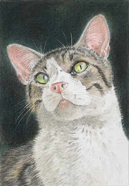
Step 10
The drawing didn’t look quite finished when I finished Step 9, but I wasn’t sure what else to do with it. The paper wasn’t accepting color very well, and unless I used workable fixative on it, it was unclear what more could be done.
So I let it sit idle for a day, then reviewed it again. Despite the fact that it didn’t look up to my usual standards, I decided it was finished. There wasn’t much more I could do with the paper surface so slick. So the image above shows the finished piece.
My Thoughts on This Project
Two main things leap to mind as I consider the finished piece.
First, it is nice to be able to print the line drawing directly on the paper, but I needed to make the image lighter. Most of the lines did disappear in the layers of color. But there are still visible lines in the white areas of the face.
Second, I either need to improve my technique with Bristol Vellum or stop using it. While I did like being able to draw detail so quickly, running out of paper tooth was a hindrance. As it turns out, how to draw a cat on Bristol is different than drawing a cat on Pastelmat.
And third, I definitely need to find a better way to document the process with artwork this small. The final photo was taken with my phone. The rest were scanned. They’re all blurry looking because I actually had to enlarge the images for this post.
Lessons learned.
How to Draw a Cat ACEO: My Thoughts
While I am satisfied that I did the best I could with this piece, I’m not convinced it’s the best portrait I’ve ever done. It was nice working with a paper that’s so smooth, but it was also a hardship. I’ve gotten used to being able to add nearly endless numbers of layers and that’s just not possible with Bristol.
I also liked being able to impress marks to add detail, but that isn’t enough of a privilege to convince me to use Bristol more often.
On the positive side, it was nice to finish a piece so quickly. I worked on this almost daily for about two weeks. Other than quick sketches, I can’t remember the last time I finished a piece in two weeks. So there were benefits to working with Bristol.
Could I have finished this piece just as quickly on Pastelmat or Stonehenge? Maybe. Size does have a lot to do with it.
I can safely say that I wouldn’t have had the same struggles on either one of those papers that I had with Bristol. But each one of them would have presented their own challenges.
I hope you’ve enjoyed this tutorial showing you how to draw a cat ACEO. Remember, this process will work for any size portrait. Adjust the size of the line drawing based on the black border.
Want to read more posts like this? Sign up for Carrie’s free weekly newsletter and be among the first to know when she publishes new articles.


Utterly stunned and amazed at the level of detail achieved by creating such a beautiful drawing at this size! As a fan of Bienfang Bristol Vellum paper, I find the amount of tooth to be just enough to grab the pigment without creating a full-on wax bloom showing up too quickly into the process, yet allows for some pretty fine detail at the same time.
I’m wondering, even with the pencils kept to needle point sharpness, could we expect to achieve the same level of detail using a surface such as Pastelmat?
We also have to consider that we are viewing the results here at a much larger scale. Viewing the finished piece at the actual size is simply mind boggling in witnessing the amount of detail achieved using your techniques and layering process.
Truly amazing…thank you so much for the tutorial Carrie!
Kim,
Thank you for your kind words and comments. I used to be able to do whatever I wanted with Bristol Vellum, but I’ve gotten so accustomed to working with Pastelmat that the Bristol is no longer fun to work on. At least not for works like this.
I intend to find out how much detail I can get with an ACEO on Pastelmat. I already have some pieces cut to size. I just need to find the right subject. A horse, maybe?
Seeing the scanned images at larger-than-life is an adjustment to me, too. I have to be careful of judging my work too harshly based on the scans. The real-life drawing looks better than the scan. That’s for sure!
Hello
I have seen that you applied several layers of color in the background only to finish finally with black. I have seen that quite a few artists who dedicate themselves to realism with colored pencils “get tired” of painting backgrounds or even of having to make multiple layers to cover the grain,And to solve it I have seen that some use an airbrush and others alcohol-based markers… and then they add the details with pencils… what do you think about that? And regarding the cat’s hairs in this case, I see that there are artists who achieve the white hairs either by scratching with a scalpel or marking the surface beforehand with a ‘groove maker’ and then gently using the pencils, I would also like to know your opinion about this, but as far as I understand (I don’t speak English)… you, dear Carrie, do it working only with pencils… it’s incredible.
Greetings and thank you for your fantastic work…
Angel,
Thank you for your comments and questions. I’ll do my best to answer them.
I know there are a lot of artists who use airbrushing and markers to do the first work on their artwork, and then finish up with colored pencils. I have never tried either method, but I know it’s possible to make fantastic art that way. There is nothing wrong with either method. The reason I haven’t tried them is that it would require purchasing new supplies and equipment. My art budget is such that I spend most of it on restocking paper and colored pencils, so there just isn’t a lot left over!
Time is another reason I’ve never tried either markers or airbrushing. Because of all the things I do, drawing time is severely limited. I know I should probably take some time to learn new methods like markers and airbrushing, but I just don’t have the desire for either.
However, a friend gifted me a set of eight pigment markers and I have been using them for sketching practice. That’s an entirely different experience, but fun!
I used a stylus to impress the whiskers and hair details in some areas on this ACEO, and that worked very well. If I learned anything, it was make more marks!
I have also tried scratching out details after applying colors. Some artists use that technique and get good results, but it didn’t help me very much. I don’t know if I didn’t have enough color on the paper, or if I was using the wrong kind of paper.
The bottom line is that I much prefer the results of using just colored pencils on paper. That’s why I don’t use solvents very much. Tools that help me manipulate the pencils either before applying color or after applying color I’m happy to experiment with. But I don’t have very much interest in mixed media techniques most of the time. When I do play around with mixed media, it’s usually either watercolor or watercolor pencils.
But there is nothing wrong with other forms of mixed media.
Thank you again for your comments!