
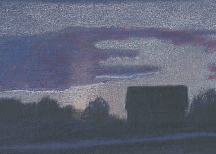
Today, I want to share my thoughts on Art Spectrum Colourfix paper, including a small step-by-step demo.
Art Spectrum Colourfix Paper
What is Colourfix Paper?
Art Spectrum is an Australian-based company that has been producing art supplies for decades. It began as a co-op venture run by a group of painters in Melbourne, Australia, and has since become the top-of-the-line source of premium artist supplies in Australia. They produce oil paints, pastels, tools, and surfaces, and such accessories as stretcher bars.
Colourfix paper has been around a long time. In fact, according to the company website, it’s the first surface developed specifically for pastel artists. There are currently three available surface textures: Original (medium coarseness), rough, and smooth.
They not only sell paper in all three grades, but also the primer in all three grades. Primer can be applied clear or mixed with a variety of different pigments so you can create you own colors and supports.
How Colourfix Paper is Made
The surface is the result of screen printing Art Spectrum Colourfix smooth acrylic primer onto heavyweight watercolor paper. The process involves no fixative to preserve the velvet bloom and vibrant colors.
The paper is acid-free and weighs in at 230 lb (340 gsm).
Colourfix papers are available in 20 colors ranging from White to Deep Black.
First Impressions
I purchased the sample pack of all 20 colors. The coated area (drawing area) is about 9×12 inches (23×30 cm) with a half-inch margin all around, so a full sheet is 10×13.
The paper is very sturdy in feel, and has a good amount of heft. The color selection is fabulous. I favor earth tones and there are twelve colors that I consider earth tones, though some lean toward green and others toward red.

But there’s also a couple of very lovely blues, nice greens (shown below), and a couple of very interesting grays.
In addition to White and Deep Black, the selection includes something called “clear.” This is the natural paper color after applying the primer without pigmentation. The resulting color is warmer and just a tiny bit darker than white, but quite a bit lighter than the lightest color created by mixing pigment with the primer.

The surface texture is between the surface texture of Clairefontaine Pastelmat and Stonehenge paper. It has a velvety feel like Stonehenge, but with more tooth. It’s the smoothest feeling textured art paper I’ve tried so far except for the back side Canson Mi-Teintes. I hear it can still take a lot of layers. That’s one thing I intend to find out.
Since the substrate is watercolor paper, it’s also suitable for wet media and for mixing wet and dry media, so long as you remember to use the wet media first, then add colored pencil once the paper is dry.
But how is it to draw on? That’s the real question.
Let’s find out together!
Working on Colourfix Paper
Basic Stroking
The method I use to start testing a new paper is simply make stroke samples. This is an easy way to discover how my pencils perform on a new paper.
I also usually use my favorite pencils, Faber-Castell Polychromos. Once I get comfortable with a paper, I try out other pencils (Prismacolor, Caran d’Ache Pablo, Derwent Drawing, for example.)
So this test combines Polychromos and Colourfix paper.
The first stroke sample is scumbling (circular) strokes. I used a sharp pencil and light pressure to create this sample, but made the more yellow color by adding more layers.

Next is a parallel stroke. With this stroke, I put the pencil on the paper and make one stroke, then go back to the beginning and make another. Strokes are placed close together to create smooth color.
Once again, the area on the left below shows multiple layers applied with light pressure and a sharp pencil.
You can really see the texture of the paper in these first two stroke samples. It’s not an identifiable pattern such as you get on the front of Canson Mi-Teintes, but it’s also not as fine-grained as UART or Pastelmat.

This sample features a stippling stroke. Marks are layered and closer together where the color is smoother. The rounder marks are made with the pencil held nearly vertical. The elongated marks are made while I held the pencil in a more horizontal position.
I had to use slightly heavier pressure for this sample. I’m guessing medium-light to medium pressure.

The final stroke sample is the directional stroke. This is a fun stroke because I don’t have to worry about smooth color. The goal is making marks in an interesting pattern to mimic whatever I’m drawing. In this case, grass.

Overall, it’s very easy to put color on Colourfix paper. There’s a lot less friction between the pencils and paper than with Pastelmat, but the surface is more velvety than Pastelmat. Building color through layering is quite easy, too.
So Colourfix gets good marks in this category.
Drawing
For my demonstration piece, I chose a simple sunset landscape and decided to continue using the Deep Ultra blue color. I’m also using Polychromos pencils.
Step 1
The silhouetted landscape was blocked in with Black. In the sky, I used Cinnamon for the pinkish color and Sky Blue for the bluer color. The setting sun is a combination of Cinnamon followed with White.
I used light pressure and short directional strokes for all of this work except the sun and the black areas. The black was applied with a variety of strokes depending on the area: Short vertical strokes for the trees, vertical strokes in the barn, and horizontal glazes applied with the side of the pencil in the foreground.
I drew the sun with scumbling strokes with White and Cinnamon.

Step 2
I continued with the same colors, adding a second round of layers to the previous work and extending the drawing up into the sky, down into the foreground, and to the left.
So far, I like drawing on Colourfix, but I’m finding that I need to keep my pencils sharper with this paper than with Pastelmat. That’s not a bad thing; it’s just a difference between the way each paper accepts color.
I’m also discovering that Colourfix creates more pigment dust than Pastelmat. Why? That’s a good question. The best explanation I can think of is that the tooth of the paper doesn’t hold the pigment particles quite as well as Pastelmat.
Something else I’m noticing is that what looks like smooth color in real life is showing up as not so smooth in the scan. That has everything to do with the darkness of the paper and some of the colors I’m using.

Step 3
The next step was an experiment. I wanted to see how well a paper stump works on Colourfix. Result? It works great! I was able to blend all of the colors with just a little bit of effort. The paper stump even helped fill in a lot of the areas where my strokes were too open in the black areas.
The paper stump doesn’t work quite as easily on Colourfix as on Pastelmat, but it does work very effectively.

Step 4
Next, I put down alternating layers of Cobalt Blue and Pale Geranium Lake in the clouds. After a few layers of each, I blended with the paper stump, then added Sky Blue and blended again.
I also lightened the sun with a mix of White and Cinnamon. To draw the light shining up into the clouds, I used very light pressure to glaze Cinnamon over the sky and clouds.

Step 5
Because I didn’t like the look of the clouds after the previous step and because I wanted to see how Gamsol solvent worked on Colourfix, that was the next step. I used a #5 sable round brush to apply a small amount of Gamsol to the areas I wanted to blend.
The Gamsol bled into surrounding areas while it was still wet. That’s different from the way it behaves on Pastelmat. I also discovered after the solvent dried that it didn’t really blend very well.
It did not damage the paper and the paper did not buckle, so that was good. But unless there’s a better way to use solvent on Colourfix, I wasn’t impressed.

Step 6
After the paper was dry, I needed to add more color to the clouds to smooth out the blotchiness. The solvent blend didn’t smooth out the blotches as much as I’d hoped it would.
Rather than try to mix the right color for the clouds, I chose the closest match by comparing pencils to the print photo I was using for reference. That color was Purple Violet. I applied Purple Violet with medium or slightly heavier pressure and using short, horizontal strokes to fill in the tooth of the paper and smooth out the color.
Then I added highlights with Cinnamon applied with medium-heavy pressure along the lower edges of the clouds and with lighter pressure within the clouds.
Next, I glazed additional color over the sky, using Cinnamon in the lighter areas and gradually fading into Sky Blue at each end.
The last thing I did was add a few trees overlapping the sky with Black and lighten the sun with Cream and White. The trees look good. I wasn’t happy with the sun because my efforts to add brighter color seemed to remove color instead. I don’t know how to explain that or how to make that area brighter other than with Brush & Pencil’s Titanium White/Touch-Up Texture mixture.

I used a Derwent Blender pencil to see how that worked on this paper and it worked quite well. I wasn’t able to fill every paper hole anywhere except where I already had a lot of color on the paper. But even in the areas where I’d only lightly glazed color, the blender made a difference.
The next step was letting the drawing sit for a day or two, then review it and see if there was anything else to do with it and (hopefully) improve it.
I decided after looking at it again that it was finished.
So, What Do I Think?
Overall, Art Spectrum Colourfix paper is much easier to work with than I expected, especially in the initial layers. It takes color very well and Polychromos pencils work well on it.
However, it doesn’t take nearly as many layers as Pastelmat does, so I wasn’t able to finesse the colors quite the way I wanted to, especially in the clouds. Working on this paper will definitely require a more thoughtful approach.
But if you want to try a textured paper that may be easier to use than Pastelmat, Colourfix might be the paper for you. It’s worth a try, at any rate.
Want to read more posts like this? Sign up for Carrie’s free weekly newsletter and be among the first to know when she publishes new articles.


Thank you for that article. I too have been curious about Colorfix although I have never tried it personally. Nice to know your thoughts on it. Might be worth a try.
Gail,
I think it’s worth a try. It’s sort of a step between smooth drawing papers and the toothier papers like UArt and Pastelmat. The sample pack I bought is a good choice, but you can also get single sheets. The biggest drawback I see is that it comes in only one size and isn’t available in pads!
A perfect product review…thorough, without any fluff. Also, I liked your suggestion about weaning from the internet…I’m going to shorten my list of “must go-to” art sites…this is one site I’ll not give up!
Cathy,
Thank you for your very kind words about this review. I try to write about the things I’m interested in reading. I’m glad that information is helpful to you.
It’s amazing how much time surfing the internet can consume, and it’s such an easy trap to fall into.
I hope you have good results like I did.
And thank you for sharing your confidence in this site! I’m glad to have you as a reader.
I have been using Colorfix paper for years and its my “go to “paper for pastel , its been available in Australia for quite a few years now. so Im glad Art spectrum have bought it out in A3 pad,,, it holds the pastel layers very well up to 5 or 6 layers no trouble at all , I have won many awards on this color fix paper ,as with layering it allows loads of depth , and brilliant color ,, I find its a good weight to work with too as I can be a bit heavy handed with the pastels , hope this is helpful, so give it a go you
Colleen,
Thank you for reading this post and for taking the time to share your experiences with Colourfix paper. I have heard that it’s a premium pastel paper.
I don’t use pastels, but am trying it with colored pencils on a small landscape. The learning curve seems quite steep and I’m struggling, but I’m also having some success, so we’ll see how it goes.
I just used Colorfix in Black with Carmen Barros class “Harvest of Glass.” I loved it for Colored Pencil!
Gail,
Great! Carmen does such wonderful work. I didn’t know she uses Colourfix. For anyone interested in trying this paper, Carmen’s class might be a good opportunity.
Thank you for sharing!
Hi Carrie, yes Carmen’s class is wonderful! It would be a great one for an intermediate artist wanting to try Colourfix.
Or an advanced artist looking to try a new subject, like me!
Yes, Carrie, that too. :)