

One of the questions I’m asked regularly concerns color selection. Artists—and especially new artists—want to know how to find the right colors for their drawings.
The implication is that there is a right way to choose colors, and finding that “right way” always results in choosing the right colors.
I hate to tell you this, but there is no right way! The plain and simple truth is that choosing the right color is sometimes a trial and error process, with a lot of error.
Yes, even for someone who’s been drawing as long as I have!
However, there are ways to sort through all the available color options and find the right colors without messing up your current drawing.
And they’re relatively easy. In fact, the most difficult part is making yourself take the time to do it!
3 Ways to Find the Right Colors for Any Drawing
Base Color, Influencing Color, Tint/Accent Color
Look at your subject, then choose the pencil that’s closest to that color. Let’s say you want to draw a red apple. Which of your red pencils is closest to the color of your subject? That will be your base color.
Chances are good the red will not be an exact match, so the next thing to determine is what other color the red of the apple leans toward. Is it more yellow or blue? Maybe it’s a little bit golden or even white.
You may find that in one place the red is definitely bluer (in the shadows,) and in another, it’s quite yellow. If you see a couple of different colors, chose the best pencil for each color. These colors will be your influencing colors.
Usually, there are also colors that appear only in a few places. I call these accent or tint colors. Choose a pencil for these colors, too.
By the time you go through this simple process, you’ll have a decent palette of colors to work with.
Color Swatches
Making color swatches is another good way to find the right colors, especially if you have to mix different colors. The key to good color swatches is studying your reference photo or subject well enough to have already decided the base colors and influencing colors.
Then make a column of color swatches for each base color. Use the same type of pressure you usually use to draw, and fill in each swatch completely. If you have three base colors, you should have three columns.
Next, make a row for each of the influencing colors. If you have six influencing colors, each column should have six rows.
Then begin layering the influencing colors over the base colors, one color per swatch until you find the best influencing color for each base color. Apply the influencing colors only to the base colors they influence.
Start with one color first. If that works, but isn’t quite right, add another color. Make note of which colors you used and in what order, so when it comes time to draw, you can refer to this color chart.
This is the color swatch chart I made for a tutorial on finding the right colors for summer grass. The base colors are labeled along the top. The influencing colors are down the side.
In this case, I tried every influencing color on every base color, but you may not need to do that.

Photo Editing Software
I’m using Affinity Photo on a Mac, but there are other apps for phones if that’s what you prefer using. Art Rage and Sketchbook are two recommended apps. Photoshop on a Mac or PC is also a great app for picking the right colors.
Irfanview is a free editing photo program. You can download the latest version at www.IrfanView.com. Versions are available for PC only, but there are some Mac equivalent programs available. When I was using a PC, Irfanview was my go-to photo editor.
The process for each app is slightly different, but the basics are going to the be same. Let’s take a look at my sample photo.
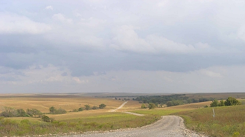
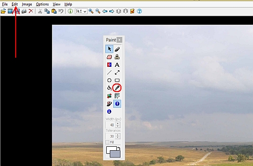
Look for an eye dropper tool. This is the standard icon for the color picking function in most photo editors. The image below shows the eye dropper circled in red. It may appear in the side bar or under the editing menu in the photo editor you use.
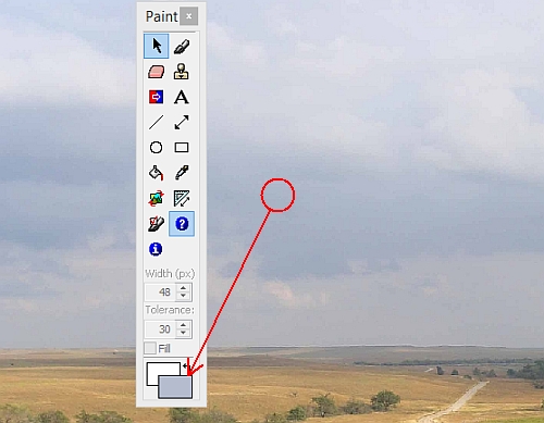
Click on whatever part of the image you want to know the color for. I’ve circled part of the sky in the illustration. below.
The color of that area appears in a color box either at the bottom of the paint dialog box (red arrow) or in a separate window.
Now look through your colored pencils to find the closest match.
That’s all there is to it! Repeat the process for each area of the drawing, and set aside your pencils.
You can either check all the major colors before you start drawing, or do like I do and check them when you begin drawing each area. Either way, this is a great way to see colors isolated from the surrounding colors. It’s also great for overcoming any natural color bias you might have.
One Caveat
If you’re not familiar with your photo editor, you need to become familiar with the menus and tool bars. Look online for tutorial videos or other information to help you learn more about your photo editor. Remember, no two are exactly alike, so do due diligence before using this method of color selection. That will save you major headaches and much frustration!
If you don’t yet have a photo editor, search for them online. You can search for free photo editors or paid services, whichever you prefer. Find one you like and learn all it can do for you.
Conclusion
Whether you use one of these methods or have your own method of finding the right colors, it’s important to match colors as accurately as possible. Don’t think that just because the apple you want to draw is red, that it’s the same red as every other apple. As I’ve learned the hard way, no two shades are exact and the only way to find the right colors all the time is to color match every subject.
Every time.
Want to read more posts like this? Sign up for Carrie’s free weekly newsletter and be among the first to know when she publishes new articles.


