
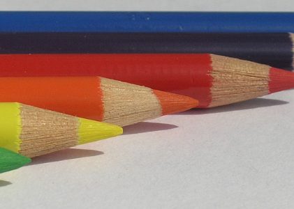
This is the fourth post in a series of posts featuring pencil tests on paper. Today, the subject is testing Faber-Castell Polychromos pencils on Bristol paper. This isn’t a combination I ordinarily use, so it makes a perfect test combination.
You can read the previous posts in the series here, here, and here.
Polychromos Pencils on Bristol Paper
To keep the tests as similar as possible, I conducted the same three tests with this combination that I used for the other pencil-paper combinations. The first two tests use light pressure, and the third test uses heavy pressure.
I also used similar colors. The Polychromos colors I chose are May Green, Chrome Oxide Green, and Cadmium Yellow.
I use Polychromos mostly on Pastelmat because they layer smoothly and allow me to continue layering for a long time. They don’t produce a lot of pigment dust, but they blend very easily with a paper stump or bristle brush on Pastelmat.
As I mentioned above, this test is the first time I’ve tried them on Bristol Vellum.
Test #1: Light Pressure
I have a naturally light hand, so I almost always start tests like this with light pressure. Usually, I let the weight of the pencil apply the pressure. I don’t increase the pressure at all.
I applied two or three layers of May Green with vertical back-and-forth strokes to begin.
Then, I applied one or two layers of Chrome Oxide Green over that, using the same pressure (light) and strokes (vertical). Color application was fairly smooth, though there’s still a lot of paper showing through. For the number of layers on the paper (less then ten), I was satisfied with the coverage.

Next, I added a few layers of Cadmium Yellow.

After that, I continued layering color, rotating through those three colors in an attempt to get the smoothest possible color. The sample below shows that I didn’t fill all the paper holes completely. The final color is also not as smooth as it could be. That’s probably due more to the way I layered the various colors than to the surface of the paper.
I don’t know if it would be possible to make more color stick or not. The paper didn’t feel quite as waxy as either the Pablo pencils or the Derwent Lightfast, but Polychromos pencils are a bit harder and dryer than both of those brands.

I also didn’t try burnishing, which is a method a lot of artists use on Bristol paper. That would probably have helped smooth out the color and fill in paper holes.
Test #2: Heavy Pressure
For the next test, I used May Green and Chrome Oxide Green for the next test, but switched to hatching and crosshatching strokes. This is a good way to create smooth color.
Unlike the first test, however, I used heavy pressure from the start. Every layer and stroke was applied with heavy pressure. I didn’t burnish, but it was the next thing to burnishing.
The resulting color is overall more smooth than what I achieved with light pressure, but there are still paper holes. More careful stroking and a sharper pencil would probably help fill in those areas. I’ve gotten out of the habit of sharpening pencils frequently because it’s not necessary with Pastelmat or other sanded art papers.
Sharp pencils are vital to layering smooth color on papers like Bristol.

I don’t know how many layers I was able to do with Polychromos pencils on Bristol, but would guess six or seven. The paper has a very slick feel to it. It could probably be burnished, but it’s doubtful that I could add more color.
Test #3: Directional Strokes
This is my favorite test of the three and that’s because it allows a bit more creativity. I love drawing grass, too!
The colors I used for this test are May Green, Chrome Oxide Green, Pine Green, and Permanent Green Olive. I didn’t use Cadmium Yellow because it was too light in value to show up. May Green is almost too light.
I was very pleased with the results of this test. The strokes are thin and tapered, just the way I like them. I was able to do some shading with the darker colors and build up a good “patch of grass” with just these colors.

This stroke would work very well applied over a base layer or two of smooth color.
The Bottom Line
Overall, I liked using Faber-Castell Polychromos pencils on Bristol vellum a lot better than I expected. Color went down smoothly and easily. Getting absolutely smooth color was a bit more difficult then I expected, but more careful stroking would help with that.
I mentioned in the Pablo on Bristol test that I was thinking about doing a landscape on Bristol. After this test, I’m thinking about it a little more seriously. Pastelmat is great for landscapes, but it’s looking more and more like Bristol might also be a good surface for a landscape drawing or two.
Want to read more posts like this? Sign up for Carrie’s free weekly newsletter and be among the first to know when she publishes new articles.


