

Today I’m comparing 8 brands of colored pencils on Stonehenge paper. Among those eight brands there are three different types: Woodless, oil-based and wax-based. The purpose is to see how each one performs on this popular paper.
I do a lot of small sketches when I have time to draw. There are several reasons for that, time being the biggest reason.
But I also enjoy the process of sitting down with a blank piece of paper and having a completed drawing within half an hour or less.
I also often do a series of sketches on the same paper, but using different pencils, just to see how the various pencils compare. You could say I’m doing research, as well as sketching.
So for this post, I used Stonehenge paper, but 8 different pencils. Here are the results.
Comparing 8 Brands of Colored Pencils on Stonehenge
Woodless Pencils
Koh-I-Nor Progresso Woodless Pencils
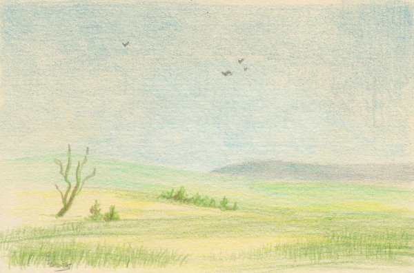
These are the only colored pencils I have that are woodless. Because they have no wood casing, you can use the tips or the sides to apply color.
I’ve been generally dissatisfied with these pencils for every application, but I haven’t done much drawing with them. So my first sketch was more like a color study than a sketch.
The scene is based on the Flint Hills in Kansas, but it’s totally imaginary.
And not as finished as I’d intended.
That was because I didn’t like the way the pencils layered on Stonehenge. Stonehenge is super soft, and does not seem like a good surface for these pencils.
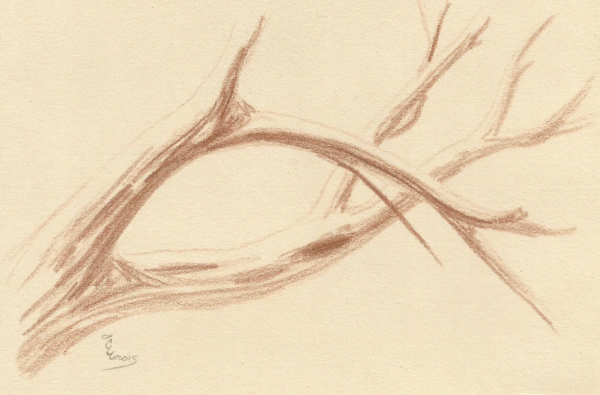
So I went back to a more typical sketching style. I like this piece much better, but am still not happy with the pencils. Getting good, dark values was difficult.
However, I do like having the ability to draw broader, softer lines.
Wax-Based Pencils
The following brands are wax-based; they have more wax in the binder than oil. In general, they are softer than oil-based pencils and lay down creamier color.
Blick Studio Colored Pencils
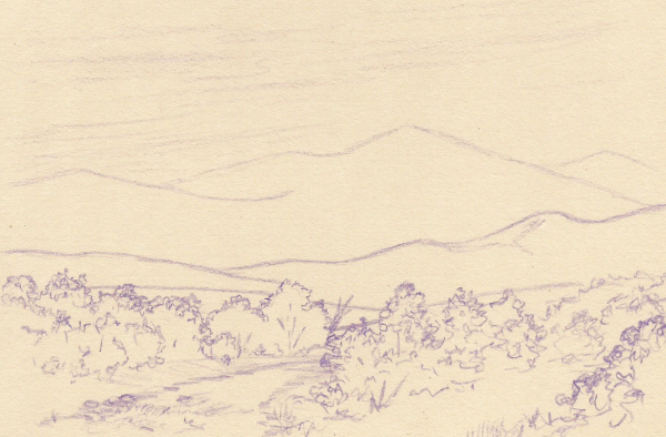
The idea of line drawing landscapes interests me deeply. For this sketch, I wanted to see if I could draw a complete landscape and show distance using only the darkness and thickness of the lines.
That was not only possible; it turned out pretty well with Blick Studio pencils.
But I had to press so hard with the Blick Studio pencil to get those dark foreground lines that I felt like I was impressing them into the paper. I don’t think I was, but I didn’t like working that way.
Prismacolor Soft Core Pencils
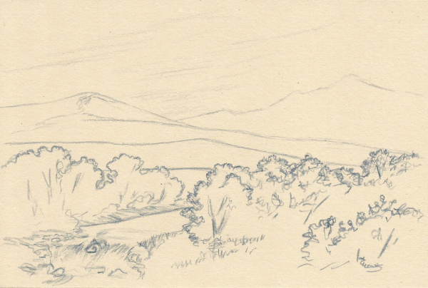
The next pencils I used were Prismacolors, and I started with another landscape line drawing. In fact, I redrew the previous sketch, but without looking at the previous sketch.
I chose Indigo Blue and it worked extremely well. I still had to use heavier pressure and repeated marking to get the dark lines in the foreground, but the overall drawing process was easier and faster.
It also felt more comfortable.
Caran d’Ache Pablo
It may surprise you to discover that Caran d’Ache Pablo pencils are wax-based, not oil-based. They are a bit harder than Luminance, but both are wax-based.
For this sketch, I chose to sketch a single tree using line quality with just a little shading. The result was very pleasing. The pencils are easy to draw with, and I was able to get light marks and heavier marks very easily on Stonehenge paper.

Crayola Colored Pencils
The final wax-based colored pencil I tried is a brand I am not likely to ever purchase: Crayola colored pencils.
I love their crayons. The smell of Crayola crayons is one of my all-time favorite non-food scents. The colored pencils are made for the same artists for whom the crayons are made. Grade school students.
So I had no interest in purchasing them, even just to test them.
But when I came into possession of a large collection of them, I decided to do a little work with them, just to see how they measured up to my expectations.
This is one of my tests.
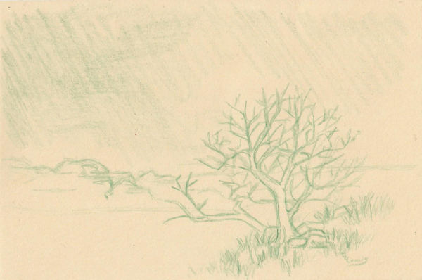
This sketch is called “The Moor”. I drew it while watching The Hound of the Baskervilles, by Sir Arthur Conan Doyle. The moor shares some characteristics with the Flint Hills and I love drawing the Flint hills, so I decided to try sketching the moor.
A better pencil would have produced better results, but I’m still surprisingly pleased with this sketch.
Clearly, Crayola pencils cannot compare with artist-grade pencils, which all of the other brands are. But I was still able to get decent variation in lines and do a little shading on Stonehenge paper.
Oil-Based Pencils
As a rule, oil-based colored pencils are harder and drier than wax-based color pencils. They hold a point longer and leave less wax on the paper.
Faber-Castell Polychromos
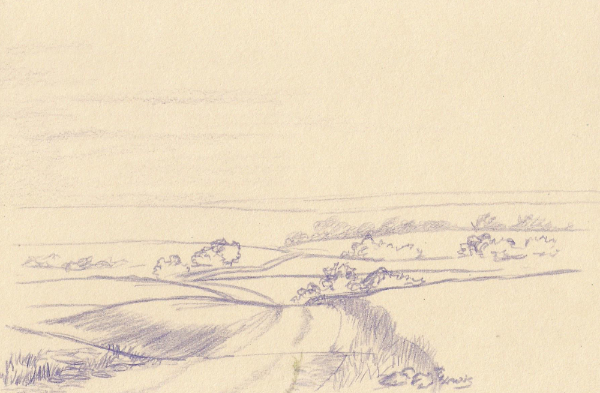
To keep this comparison as consistent as possible, I sketched another line drawing landscape.
I did a little more shading with this one than with the other line drawings. But I still relied on line thickness and darkness to convey the look of distance.
Polychromos worked pretty well on Stonehenge despite their relative hardness. I did have to use a little more pressure to draw the darker lines in the foreground, but it was still acceptable.
Drawing the lighter lines in the background was a breeze.
Lyra Rembrandt Polycolor
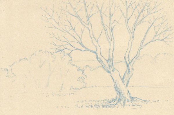
I have only one Lyra Polycolor pencil in my collection. To be truthful, I wish I had more. Sketching this simplified landscape was pretty easy. I think the Polycolor was easier to get darker values with than Polychromos, but it’s difficult to tell with a color as light as this blue.
The sketch is pretty simple, but I really like the way it turned out.
And I liked using the Polycolor pencil.
How I Rate these Pencils
I made some interesting (and surprising) discoveries through this exercise.
Caran d’Ache Pablo and Lyra Rembrandt Polycolor pencils turned out to be my favorites on Stonehenge paper. They both performed very well and I didn’t have to press very hard to get the darker values. I rate them about equal in ease of use and overall performance.
After that, my favorites, Polychromos and Prismacolor, tied for second. That’s not surprising. The really good pencils generally perform well on most surfaces. And they weren’t that far behind the first two.
The Blick Studio pencils were okay with Stonehenge. I could adjust to them if I had no other pencils. But sanded surfaces are a better match for them, in my opinion.
Koh-I-Nor Progresso Woodless Pencils are still at the bottom of the list, but they’re joined by Crayola colored pencils.
The most interesting discovery was the fact that Stonehenge has fallen from favor with me. It just seemed too soft and spongy after all the work I’ve done on the sanded art papers. In fact, I wonder if my problems with the pencils were really problems with the paper.
And to think that Stonehenge was once my go-to paper!
Comparing 8 Brands of Colored Pencils on Stonehenge
Another interesting sampling of different types of pencils on Stonehenge paper. I hope you enjoyed the results as much as I did.
Sign up for Carrie’s free weekly newsletter and be among the first to know when she publishes new articles.


I really like hearing how the different pencils work for you. That information would probably influence my interest in buying other pencil brands, if I were going to buy. Thank you for sharing all this Carrie. BTW… your sketches look great!
You’re welcome, Gail.
It would certainly have helped me when I was getting started, too.
This is very helpful information, when there are so many variable effects in combining different brands of pencils and paper. Bit of a nightmare for beginners like me. Thank you.
I enjoy your samples too.
Bob,
Yes, sorting through all the papers and brands of pencils can be a bit of a nightmare, as you put it. So I’m glad you found this article helpful.
Thank you for taking the time to leave a comment.