

Today, I want to walk you through my process of redesigning an old composition. The original artwork was first created in 2018. I wrote about sketching that composition directly onto Fisher 400 paper a couple of weeks ago.
Since then, I also showed you how I experimented with the finished drawing. That drawing turned out all right originally, but I never really liked it. Thinking it was impossible to ruin it, I tried some methods of lifting color and then applying new color. How did that turn out? You can read that here.
Since the overall idea is still appealing, and since parts of the drawing turned out well the first time around, I decided to do a little more experimenting. This time, I’m experimenting at the front end of my drawing process: Redesigning the old composition to make it better.
Redesigning an Old Composition
I’ll be redesigning from the original reference photo. This is the same photo I worked from for the original drawing. I’m using it again because I like the scene; it just needs a little fine-tuning to make the composition work.
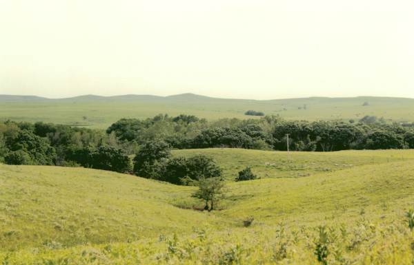
I prepared the photo by lightening it in a photo editor (Affinity Photo) so I could see more details and see them more clearly. This is always helpful if you need to see shadows and/or the details in shadows in a photo that’s otherwise too dark.
My original intention was to do a series of small sketches using the basic composition, but with changes. But life got so busy at the last minute that I opted to do my “sketching” in Affinity Photo. My goal was still the same: Finding a clear center of interest and creating a composition that really stands out.
Besides, digital sketches show up much better in these illustrations than my pencil sketches would have.
Let’s get started.
Composition #1
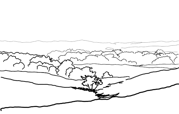
This is the way the photo looks as a sketch. There are some differences because my hand is not as steady with a mouse as it is with a pencil. But the basic arrangement is the same.
Composition #2
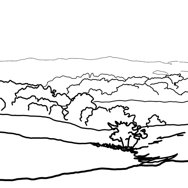
The first change I made was a radical one: I cropped the entire composition so it was square, with the trees that I wanted to be the center of interest still the center of interest.
Composition #3
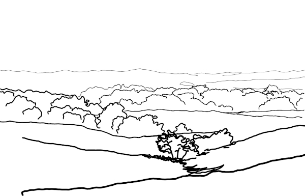
Back to the original configuration.
But this time, I moved the trees in the foreground to the right a little, and added more trees to the right of them. That made the entire group more “weighty” and important.
Composition #4
Next, I replaced the original trees, which are a bit scrawny, with a tree belt that’s more like the rest of the trees in the composition; just larger and closer to the foreground.
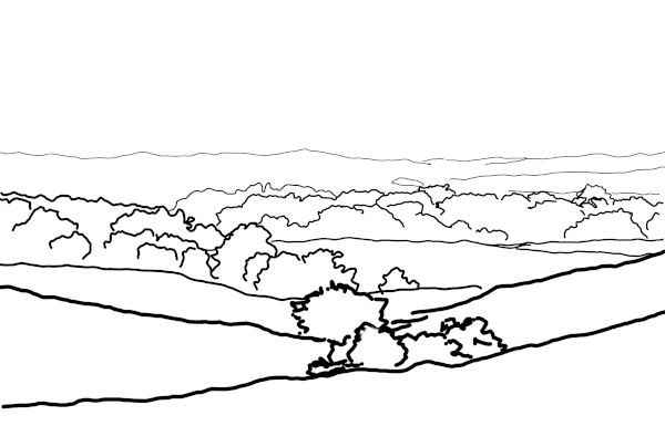
Composition #5
For this next design, I went back to the original idea, and simply cropped it. Rather than a square crop, I chose a 2:1 crop. This produced a composition that was twice as wide as it was tall. Although it removed a lot of the image, it resulted in a format that better reflects the vast distances of the Flint Hills.
The trees that are supposed to be the center of interest are now in the right place in the composition. There’s enough sky to show, and enough foreground to place everything in perspective. But there isn’t enough of either sky or foreground to detract from the landscape elements.
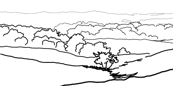
Composition #6 & 7
Finally, here are a couple of compositions featuring a river winding through the foreground and middle ground. I like streams in landscapes, but for some reason, have never actually drawn one. Here are two possibilities.
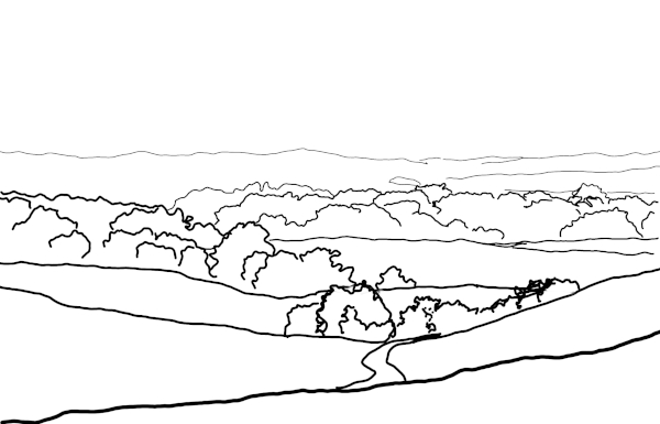
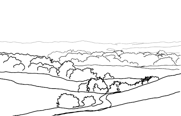
Additional Redesign Notes
When I was working with the reference photo enlarged on my computer screen, I noticed something I’d never noticed before.
I don’t know if you can see them or not, but there is a line of fence posts along the top of the hill, beginning on the right and moving left in this photo.
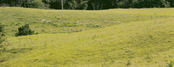
I had never seen them before. They’re so small in the photo, and so close in color and value to the grass that they disappeared.
Now I usually like my landscapes to be devoid of anything manmade, but when I spotted that fence, my first thought was: There’s something I can use!
What do you think?
Redesigning an Old Composition
None of these compositions are anywhere near good enough to convert into a drawing.
But every one of them has possibilities.
What’s the next step? Choosing the best of them (or my favorites), and working with them a little more with pencils and paper. I enjoy using photo editing software to do sketches like this, but it’s more fun with pencil and paper. I can also work out more intricate detail.
And when one of the compositions becomes the best composition, I can continue working it through to a more complete sketch and, eventually, a line drawing.
So this is just the first step, whether I use pencils or the mouse.
I hope you enjoyed this three-part look at this particular landscape. Hopefully, I’ve also helped you see that even finished drawings can be reworked and improved upon.
If you missed the first two posts, you can read them here and here.
Sign up for Carrie’s free weekly newsletter and be among the first to know when she publishes new articles.


